
Affiches SAT
A complete promotional poster series designed to boost visibility and engagement for the Service d'accueil et de transition (SAT).
The Problem
The Service d'accueil et de transition (SAT) lacked a cohesive and eye-catching visual language for their promotional materials. Their existing posters were disjointed and struggled to capture the attention of their target audience, resulting in lower engagement with their services.
The Solution
I developed a unified visual identity inspired by their core mission, resulting in a striking series of promotional posters and social media assets. By establishing a robust design system with clear typography and consistent color palettes, the new assets cut through the noise.
Final Deliverables
- Print-ready Promotional Posters
- Social Media Graphics (Instagram)
- Brand Style Guide & Component Library
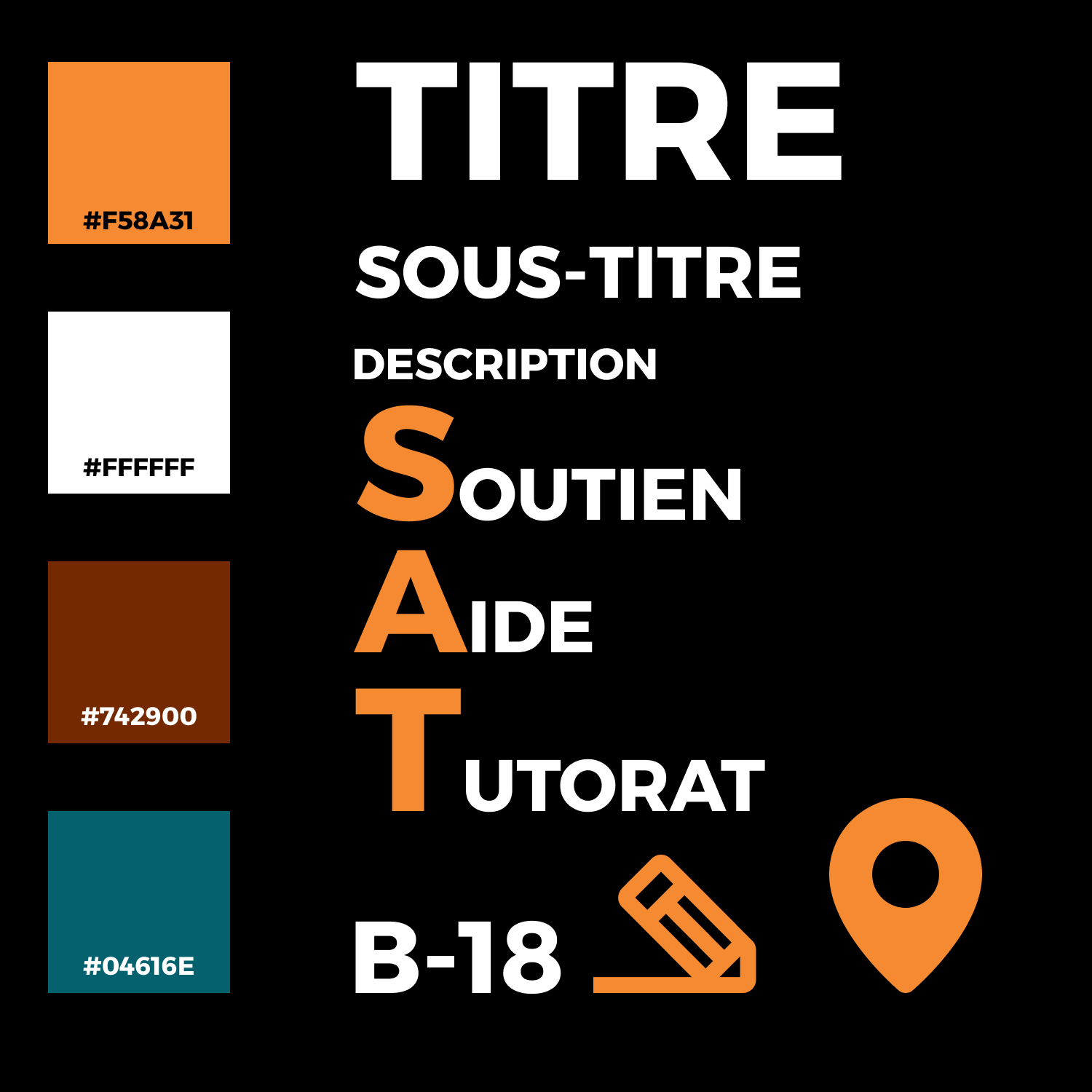
Visual Identity & Style
Design Decision: I drew inspiration from the few successful elements of their previous branding and modernized them. I chose a bright, highly legible typography scale to ensure the posters could be read from a distance.
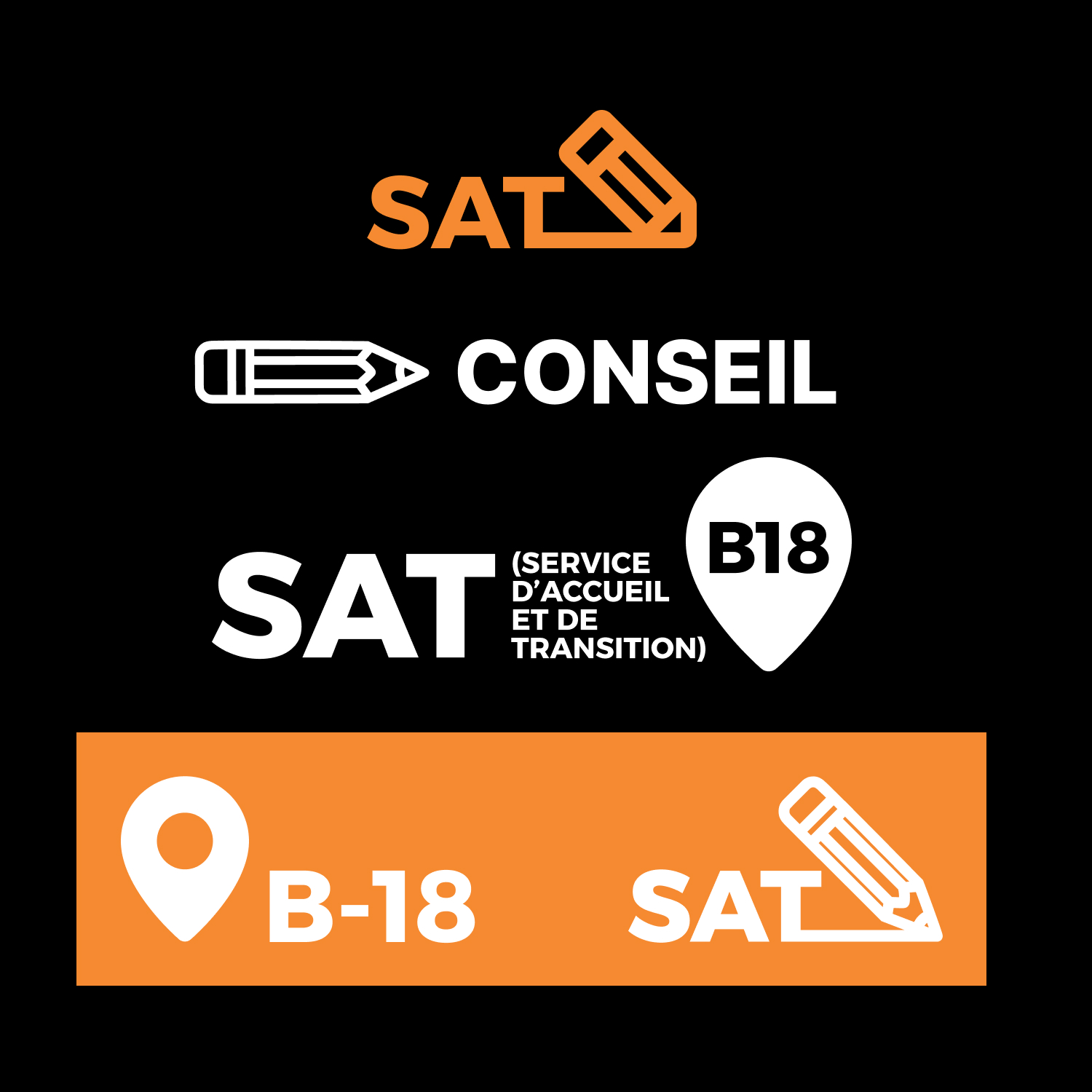
Component System
Process: To ensure scalability, I built a rigid component system in Figma. This allowed me to rapidly iterate on different poster layouts and social media formats without breaking the established brand rules.
The Challenge
Challenge: Balancing a professional institutional tone with a modern, approachable aesthetic that appeals to a younger demographic.
Solution: I utilized a strict grid layout for information architecture to maintain professionalism, but introduced dynamic, flowing graphic elements and vibrant contrasting colors to inject energy.
The Results
Impact: The project delivered a versatile design system that the client can continue to use.
- Client approved and deployed across campus
- Created a reusable, highly modular design system
- Significantly improved clarity of communication
Technologies Used
Gallery